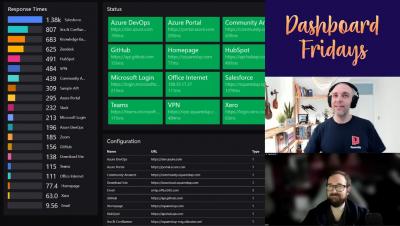
SquaredUp helps customers create dashboards that connect the dots. They do this by assisting users in visualizing and sharing data. And, for the most part, they do this by displaying in dashboards what is happening now. Of course, some visualizations show some historical values or whatnots, but tiles like the WebAPI tile only display a specific value at one particular moment in time. But have you ever wanted to “see” what your application looked like right before an outage?
SquaredUp 5.2 is now available! This update brings you enhancements to the PowerShell tile, new Splunk visualizations, various security improvements, and excitingly, a brand new Dashboard Gallery and OpenSource GitHub Samples repository. Keep reading to find out more.
Josh Chessman, Senior Analyst at Gartner, spoke at SquaredUp Live 2021 on the future of IT operations (IT Ops) monitoring and how monitoring teams need to change to get there. Here are some of the highlights from his talk.
We’ve come to the end of the Dashboard Server Learning Path. In this final instalment, let’s take a look at the remaining two tiles – the Image tile and the Web Content tile. We’ll start with the image tile first.
Thank you SCOM community for once again making SCOMathon a huge success! This year, our virtual conference on all things SCOM spanned not one, but two days, across multiple time zones – from Australia to the West Coast of the United States and everywhere in between.
Microsoft have announced a new management pack for Office 365 – M365! It completely replaces the Office 365 management pack and is packed with new capabilities. Aakash Basavaraj, Program Manager at Microsoft, and Sameer Mhaisekar, Technical Evangelist at SquaredUp, joined Bruce Cullen, Director of Products at Cookdown, to reveal the new capabilities of the M365 management pack and the accompanying dashboard pack created for SquaredUp.
SquaredUp, Technical Evangelist In this part of the Dashboard Server Learning Path, let’s take a look at the Azure tile. This tile will allow you to connect to and query App Insights and Log Analytics workspaces using Kusto Query Language( KQL), which offers features such as sorting, projection and calculated values, which we can use to control the display of data in our dashboard. If you are new to KQL, We have a series of blogs that can help you get started.
SquaredUp, Technical Evangelist This should be a quick one. As some of the existing SquaredUp customers might recognize, this tile is basically an enhanced version of the more generic WebAPI tile – with the enhancement being easy authentication. In comparison to the <