Operations | Monitoring | ITSM | DevOps | Cloud

InfluxData

TL;DR InfluxDB Tech Tips - How to Extract Values, Visualize Scalars, and Perform Custom Aggregations with Flux and InfluxDB

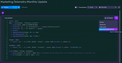
In this post, we learn how to use the reduce(), findColumn(), and findRecord() Flux functions to perform custom aggregations with InfluxDB. This TL;DR assumes that you have either registered for an InfluxDB Cloud account – registering for a free account is the easiest way to get started with InfluxDB – or installed InfluxDB 2.0 OSS. In order to easily demonstrate how these functions work, let’s use the array.from() function to build an ad hoc table to use in the query.

Webinar Highlights: How Texas Instruments Uses InfluxDB

It’s back to school season, and oftentimes, that means people are purchasing TI-84 calculators for their kids. But did you know that Texas Instruments makes so much more than calculators? 😁 Michael Hinkle, a Probe Engineering and Manufacturing Supervisor at Texas Instruments, recently presented on “How Texas Instruments Uses InfluxDB to Upload Product Standards and to Improve Efficiencies”.

Getting Started with Sending StatsD Metrics to Telegraf & InfluxDB

This tutorial will walk you through sending StatsD metrics to Telegraf. StatsD is a simple protocol for sending application metrics via UDP. These metrics can be sent to a Telegraf instance, where they are aggregated and periodically flushed to InfluxDB or other output sinks that you have configured. At the time of writing, we have 37 different output plugins supported.

A Deep Dive into Machine Learning in Flux: Naive Bayes Classification

Machine learning — the practice of writing algorithms that improve automatically through experience — has become a buzzword nowadays that connotes to something otherworldly and on the bleeding edge of technology. I’m here to tell you while that may be true, getting started with machine learning doesn’t have to be hard!

Community Highlight: How InfluxDB Enables IoT Sensor Monitoring of Aquariums

I recently spoke with Jeremy White who is using InfluxDB to monitor his aquariums. By collecting IoT sensor data, he has been able to better understand his 200 gallon salt-water aquarium full of fish and coral. The entire project can be found on GitHub. Caitlin: Tell us about yourself and your career. Jeremy: I’m a Senior Network Automation Consultant at Network to Code, and my background is in networking engineering. Network to Code is an industry leader in network automation.

Working Remote: Keeping Culture Alive During Unprecedented Times

Team-building remains an important priority despite the shift to remote work, but doing remote team-building well is even trickier than it was when everyone was in the office. This article sheds light on the creative approaches we take to remote team-building and my advice for other businesses that are struggling to adapt their cultural initiatives to a remote setting.

Putting You in Control of Your InfluxDB Cloud Spend

We recently changed the pricing of InfluxDB Cloud to let you control your cloud database spend so you spend only as much as you need to run your software and systems — with no wasted budget. If you just want a summary, check the InfluxDB Cloud pricing page. But if you’d like to nerd out on the changes we made, why we made them, and how to estimate your monthly spend on InfluxDB, then buckle up for a deep dive.

Data Layout and Schema Design Best Practices for InfluxDB

Figuring out the best data layout for InfluxDB v2 is important in optimizing the resources used by InfluxDB, as well as improving ingestion rates and the performance of queries and tasks. You also want to consider developer and user experience (UX). This post will walk you through developing a schema for an IoT application example and answer the following questions.

Monitoring Your Data with the Mosaic Graph Type

InfluxDB provides several graph type visualizations to allow users to easily monitor their data. However, most of those graph types are only helpful if your data can be represented numerically. What if you want to track the health of your application, or visualize the status of your pods deployed in Kubernetes, over time? In both these cases, status is tracked over time using one of several discrete values, and can’t be plotted on an x/y chart.