Visualize Geotemporal Data with InfluxDB Cloud's New Map Graph
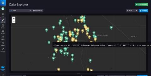
We recently introduced a new Map graph type into InfluxDB Cloud to help users visualize time series data that includes position. Above is a graph showing the most recent earthquakes in California, where the color of the marker indicates their magnitude. In this post, I’m going to walk through the ways to ingest geotemporal data into InfluxDB Cloud, and how to use the new Maps visualization type.


