Dashboards

New release: SquaredUp 5.4 - Bring your answers to the surface

SquaredUp 5.4 is here and it’s got some brilliant new features and upgrades to help you troubleshoot and find answers faster than ever. You’ll find the upgrades across all three SquaredUp editions – for SCOM, Azure, and the free Community Edition. Here are the highlights in the new release: Check out our release webinar for a detailed walkthrough and demo.

Dashboard Fridays: Sample au2mator Services Dashboard

Our au2mator customers heavily use the au2mator Self Service Portal to present automation as a delegated task to the Service Desk, Users, and Admins. This dashboard shows how au2mator were able to visualize all their services within a single SquaredUp dashboard. Using SQL, PowerShell, Azure Log Analytics, and Web Content, au2mator made a dashboard that looks simple but visualizes a lot. Join Adam Kinniburgh and special guest Michael Seidl from au2mator as they demonstrate how this dashboard was built, the challenges it solves and how you can get the dashboard pack!

A look at how the U.S. Department of Defense deploys the Grafana stack

In September 2021, the U.S. Department of Defense’s Iron Bank formally authorized Grafana, Grafana Enterprise, and Grafana Loki, allowing the 100,000 employees and contractors who work on DoD software, both classified and unclassified, to easily select and immediately deploy Grafana Labs software without additional approvals and security certifications. In our first-ever government session at ObservabilityCon 2021, former U.S.

Pro tip: How to use semi-relative time ranges in Grafana

If you’re even the slightest bit familiar with how Grafana dashboards work, you’ve probably realized that the time range selector is one of the most important features. After all, when you’re using Grafana to visualize time series and logs, defining a time range is required for metrics and logs queries.

Optimize your resource classes with the CircleCI resources dashboard

CircleCI cloud offers over 20 resource classes (varying CPU and RAM) across multiple execution environments. Finding the best resource class size for your job — not too big and not too small — can sometimes be a challenge. But now, you can view CPU and RAM usage for Docker executors within the UI. The new dashboard, found in the new Resources tab on the job details page, displays the CPU and RAM, for all parallel runs in your Docker job.

Data Visualizations with InfluxDB: Integrating plotly.js

One of the great features of the InfluxData cloud platform is that it comes out of the box with all the tools you need to quickly read and write your data to the database. Here, we’ll walk through creating data visualizations with InfluxDB and plotly.js, a JavaScript graphing library built on top of d3.js and stack.gl.

Dashboard Fridays: Sample Excel Business KPIs Dashboard

The Management Team at SquaredUp needed a dashboard to visualise key metrics related to the different sectors of business to keep an eye on the KPIs and track targets. This dashboard keeps track of the different key targets set for the business over three time periods and highlights variations. The dashboard also plots the trend on different values hit over the time and helps identify fluctuations.

Video: How to build a Prometheus query in Grafana

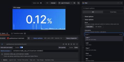
Once you have set up your Prometheus data sources in Grafana, it’s time to put them to work. In the one-minute tutorial video below, we show you how to build a query in Grafana 8.3 with Grafana’s easy-to-use Explore mode. Prometheus uses a query language called PromQL. If you are already familiar with PromQL, you can simply enter your query in the text field and run the query.