How relabeling in Prometheus works
Relabeling is a powerful tool that allows you to classify and filter Prometheus targets and metrics by rewriting their label set. The purpose of this post is to explain the value of Prometheus’ relabel_config block, the different places where it can be found, and its usefulness in taming Prometheus metrics. Much of the content here also applies to Grafana Agent users. For reference, here’s our guide to Reducing Prometheus metrics usage with relabeling.
Managed self-hosted Git service Gitea with the new integration for Grafana Cloud
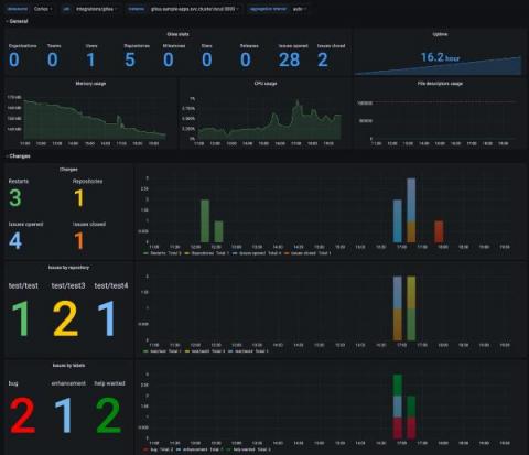
Today I’m back with another integration available for Grafana Cloud, our observability platform that gathers all your metrics, logs, and traces under a single roof with Grafana. I’m going to highlight how you can use Grafana with Gitea, an open source forge software package for hosting software development version control. It uses Git as well as other collaborative features like bug tracking, wikis, and code review. It is a great choice for those who manage Git repositories.
Taking care of your loved ones with Grafana and other open source solutions
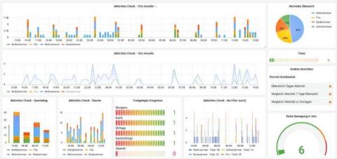
Amon Reich is the founder of SmartLiving.Rocks based out of Schweinfurt, Germany, an IoT solutions provider for smart homes and small businesses. Amon maintains the open source SeniorenSmarthome project, which enables Ambient Assisted Living through Grafana dashboards and other open source technologies. I’ve been working in the field of smart technology for over 10 years.
How to best organize your teams and resources in Grafana
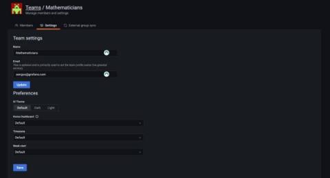
Almost every company who sets up Grafana as part of an observability or data visualization service has multiple teams, divisions, or customers of their own to serve.
GitOps Dashboard on Codefresh Classic
We think Grafana Labs has built something special - and two prestigious lists agree
We have always thought of our organization as special. Our plans were never to build a traditional business, and we know we have a unique culture. But it is nice when others outside of our company recognize that Grafana Labs is something special, too. This week, we were excited to be included on two very prestigious lists: The Enterprise Tech 30 and America’s Best Startup Employers.
Dashboard Fridays: Log Analytics VM Updates
Introducing New Storage Dashboards in the Cloud Monitoring Console (CMC)
Monitoring and gaining additional insights about usage of your Splunk Cloud Platform deployment is essential for effective management as a Splunk admin. Your Splunk Cloud comes with the Cloud Monitoring Console (CMC) app, which displays relevant information about the status of your Splunk Cloud environment using pre-built dashboards.

