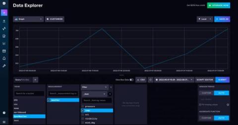
If you’re building an IoT application on top of InfluxDB, you’ll probably use a graphing library to handle your visualization needs. Today we’re going to take a look at the charting library, Highcharts, to visualize our time series data with InfluxDB Cloud. However, I also encourage you to take a look at Giraffe, a React-based visualization library that powers the data visualizations in the InfluxDB 2.0 UI.
As the Industrial Age Army transforms to the Information Age Army, Army leadership recognizes the need for adaptable technologies that enable data exchange at the tactical edge. Not only must these technologies be in lock step with the 8 guiding principles of the DoD Data Strategy, but they must also deliver on the Army’s data imperatives of speed, scale and resilience.
If you’ve ever lived DataOps, you’ll know that it’s a challenge at the best of times. A day in the life of a typical data engineering team involves securing, releasing, debugging and stabilising complex and oftentimes fragile data pipelines. These pipelines can involve many source applications and intermediaries, and troubleshooting them under management pressure when it’s all going wrong is stressful.
One of the best things about getting started with InfluxDB over traditional relational databases is the fact that you don’t need to pre-define your schema in order to write data. This means you can create a bucket and write data in seconds, which can be pretty powerful to developers who care way more about the application they’re building than the mechanics of storing the data.