Operations | Monitoring | ITSM | DevOps | Cloud

Dashboards

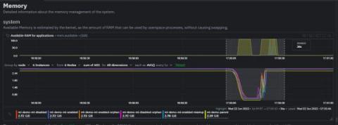
New in Prometheus v2.19.0: Memory-mapping of full chunks of the head block reduces memory usage by as much as 40%

The just-released Prometheus v2.19.0 introduces the new feature of memory-mapping full chunks of the head (in-memory) block from disk, which reduces memory usage and also makes restarts faster. I will be talking about this feature in this blog post.

Learn Grafana: How to automatically repeat rows and panels in dynamic dashboards

Running your software on dynamic infrastructure means that your monitoring platform needs to change dynamically. Variables let you reuse a single dashboard for all your services. Select the service you want to inspect from a drop-down menu, and watch panels update to only show you metrics from that service. Grafana lets you create dynamic dashboards using template variables. Any variables in your queries interpolate the current value of the variable before the query is sent to the database.

How Hiya migrated to Grafana Cloud to cut costs and gain control over its metrics

Last year, when a company that works with several of the world’s top carriers, OEMs, and enterprises to provide caller identity and spam blocking services for more than 120 million users needed to make changes to their monitoring service, Grafana Labs got the call. Hiya was founded in 2016, and from the start was a container-centric Kubernetes shop.

Azure dashboards: SquaredUp vs. Azure portal (Part 2 - Application Insights)

In Part 1 of this series, we compared the Azure portal vs. SquaredUp in terms of how easy it is to make a VM-level dashboard and how good that dashboard is in terms of features and functionality. In this one, we will compare the two portals in terms of application-level dashboards.

Web Monitoring Dashboards | The SRE's Ultimate Multi-Tool

It’s 3 AM and you are roused out of sleep by the dull buzzing of your phone in the other room. Some sort of emergency, you conclude as you fumble with the lockscreen. There it is: an alert that the API governing user registration is acting up. When we think about the lag between time of incident and time to respond, it’s not just about how long the system went down. How long it physically takes us to respond to the problem also contributes to lost downtime.

Advanced Guide to Kibana Timelion

Kibana Timelion is a time-series based visualization language that enables you to analyze time-series data in a more flexible way. compared to other visualization types that Kibana offers. Instead of using a visual editor to create visualizations, Timelion uses a combination of chained functions, with a unique syntax, to depict any visualization, as complex as it may be.

How To Pick The Right Type of Log Data Visualisation

Data visualisations allow users to organise and present log data in a practical, usable, and sensible manner. This tool in log management ensures that the data collected communicates real-time, actionable insights that will support timely and informed decision-making. Knowing which types of visualisation best suits a particular data set is critical in giving data visualisation optimal business value. Here is how to pick the right type of log data visualisation. Pie charts