Operations | Monitoring | ITSM | DevOps | Cloud

Dashboards

Introducing a new dashboard creation experience in Cloud Monitoring

Having good observability is vital to the health of your cloud infrastructure and applications, and a key element to using that information effectively is being able to create dashboards with relevant metrics. Today we are announcing a new dashboard creation experience from Cloud Monitoring that allows you to generate a greater variety of visualization types, introduces better flexibility for dashboard layouts, and makes data manipulation easier so you can create dashboards that better fit your needs.

New Open Access with SquaredUp 5.0

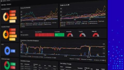
Our Open Access feature enables easy, and unlimited sharing of dashboards across your organization – with any audience at all. A highly popular feature, these shared dashboards help you bring better visibility and collaboration – conveying the shared “truth”! With our latest release SquaredUp 5.0, we have made Open Access dashboards fully interactive, like the rest of our dashboards, so you can see that next level of detail you’ve been wanting.

With the new AWS IoT SiteWise plugin, you can visualize and monitor your equipment data in Grafana dashboards

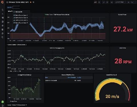
In collaboration with the AWS team, we have just launched another AWS integration, the AWS IoT SiteWise plugin for Grafana. AWS IoT SiteWise is a managed service that helps users collect, store, organize, and monitor data from industrial equipment, across facilities, at scale.

New Magic Dashboard for Ruby on Rails: ActionMailer

Monitoring your application can be a difficult task if you’re just getting started with it. You need to know which metrics matter most and understand which ones you can combine into meaningful graphs. In the (not just holiday ⛄️) spirit of making things smoother for our users, we’ve added a magic dashboard to the Ruby integration that shows you the volume of emails you are sending with ActionMailer.

Improved Dashboard Designer experience with SquaredUp 5.0

At SquaredUp, we are all about dashboards and visualizations that enable you to build the ideal single pane of glass. If you work in monitoring, you know that designing the perfect dashboards that give you all of your important metrics at a glance, is easier said than done. Most of the time, it takes several attempts to optimize a dashboard for easy reading, and more often than not, this step is neglected. I wouldn’t recommend skipping over this step though.

Our new partnership with AWS gives Grafana users more options

At AWS re:Invent today, Dr. Werner Vogels, VP and CTO of Amazon.com, announced a partnership between AWS and Grafana Labs, resulting in the Amazon Managed Service for Grafana, a scalable managed offering that provides AWS customers a native way to run Grafana directly within AWS alongside all their other AWS services. We’d like to give a big thanks to the whole Grafana community. Not only have they inspired us with so many great use cases, but they help us build better software every day.

AWS and Grafana Labs are working together on cloud native observability

Cloud native observability is at a watershed moment. The explosion of microservices has created previously unseen amounts of monitoring data, limiting the ability of humans and computer systems to extract meaning from data with last-generation tools. Debugging is often a process of detecting correlation, and then turning correlations into causal connections. This is where modern cloud native tooling comes in.

How to bring Jupyter Notebook visualizations to Kibana dashboards with Vega

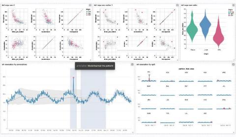
In this blog post you’ll learn how to create visualizations for Kibana dashboards from Jupyter Notebooks. The good news for you as a Python developer: You won’t have to spend time writing cumbersome plain JSON documents or even JavaScript code. Under the hood, we’re going to make use of Kibana’s Vega plugin which became generally available with Elastic Stack 7.10.

The 'What' and The 'How' of an Effective Monitoring Dashboard

The Network Monitoring Dashboard is critical for your users to process, interact with, and analyze data. While most enterprise teams understand the essentiality of dashboards, they often fail to maintain the efficacy of a well-designed dashboard. A common phenomenon among dashboards is that even the most sophisticated-looking dashboards, embedded with colorful graphics, can be deceptive and uninformative for the decision-making process.

How Grafana is helping the DIFFERENCE Foundation visualize medical data in their fight against a global pandemic

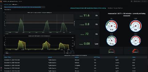
The DIFFERENCE Foundation is a non-profit organization based in the Netherlands that is focused on designing, guiding, and funding highly quantitative research on metabolic dysfunction. The foundation considers metabolic dysfunction—which can trigger obesity, diabetes, many other diseases—the original global pandemic, as it affects almost one quarter of the global population.