Operations | Monitoring | ITSM | DevOps | Cloud
Dashboards
Building powerful tailored dashboards: end users, management, infrastructure
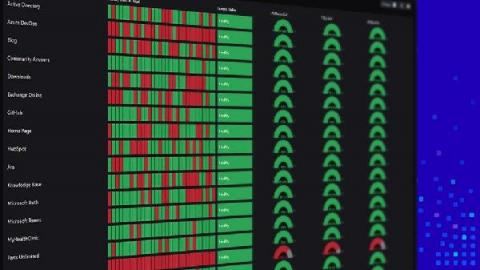
In my position, I get to work with a wide variety of organizations that each have a different level of monitoring maturity. But I’ve noticed an emerging pattern that I’ll call the ‘Critical Service Offering’ or ‘Executive Level Status’ dashboard. At their most basic level, these dashboards should communicate the current health of the application, provide some historical context and, most importantly, not be tied to infrastructure monitoring.
Building powerful tailored SCOM dashboards with Enterprise Applications (Part 1)
In my position, I get to work with a wide variety of organizations that each have a different level of monitoring maturity. But I’ve noticed an emerging pattern that I’ll call the ‘Critical Service Offering’ or ‘Executive Level Status’ dashboard. At their most basic level, these dashboards should communicate the current health of the application, provide some historical context and, most importantly, not be tied to infrastructure monitoring.
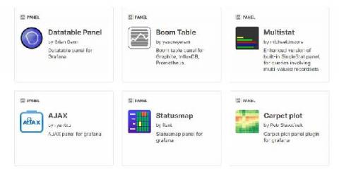
6 tips for improving your Grafana plugin before you publish
Are you putting the final touches on your plugin before you submit it to the Grafana plugin page? In this article, I’ll share a few tips for how to add that extra polish to your plugins. This article assumes that you already have some knowledge of building plugins for Grafana. If you’re looking to build your first plugin, start by following one of our plugin tutorials.
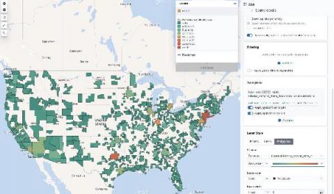
How to map custom boundaries in Kibana with reverse geocoding
Want to create a map of where your users are? With the GeoIP processor, you can easily attach the location of your users to your user metrics. Right out of the box, Kibana can map this traffic immediately by country or country subdivision: Plus, the new User Experience app for Elastic APM automatically creates maps based on monitoring data: But what if you want to take this one step further and create maps with different regions?
Dark Theme is here
Best Data Visualization Tools for a Winning Business Presentation
Data visualization is a simple presentation of data or information in a graphical format. Humans are naturally drawn to colors and patterns and these tools make it easier for people to interpret and understand data. Numbers are complex and they can be difficult to understand conceptually. Whereas, data visualization or pictorial representation can spark an interest in your audience to listen and learn more from your presentation.
New Health Explorer for Azure VMs
Yup – we've now got a health explorer for Azure VMs! Health Explorer… now why does that sound familiar? You’ve probably guessed it by now, but here’s another hint: Hmm…now where have I seen that before? Right – in SCOM!
How Prometheus monitoring mixins can make effective observability strategies accessible to all
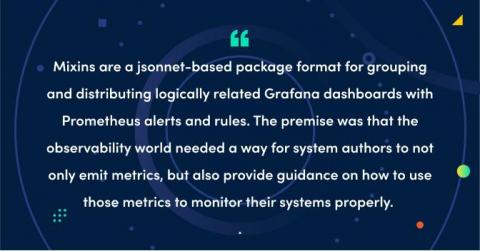
Three years ago, Tom Wilkie and Frederic Branczyk sketched out the idea for Prometheus monitoring mixins. This is a jsonnet-based package format for grouping and distributing logically related Grafana dashboards with Prometheus alerts and rules. The premise was that the observability world needed a way for system authors to not only emit metrics, but also provide guidance on how to use those metrics to monitor their systems properly.
How to get started quickly with metrics, logs, and traces using Grafana Cloud integrations
Grafana Cloud is the easiest way to get started observing metrics, logs, traces, and dashboards. When we say “easiest,” we mean it: Grafana Cloud is designed so that even novice observability users can use it. As a new user, you are not required to dive into the complexity of setting up Prometheus and figuring out how to create Grafana dashboards from scratch. Integrations are the reason why.


