Operations | Monitoring | ITSM | DevOps | Cloud
Dashboards
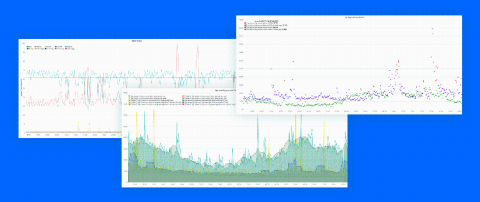
Advanced Guide to Kibana Timelion
Kibana Timelion is a time-series based visualization language that enables you to analyze time-series data in a more flexible way. compared to other visualization types that Kibana offers. Instead of using a visual editor to create visualizations, Timelion uses a combination of chained functions, with a unique syntax, to depict any visualization, as complex as it may be.
How To Pick The Right Type of Log Data Visualisation
Data visualisations allow users to organise and present log data in a practical, usable, and sensible manner. This tool in log management ensures that the data collected communicates real-time, actionable insights that will support timely and informed decision-making. Knowing which types of visualisation best suits a particular data set is critical in giving data visualisation optimal business value. Here is how to pick the right type of log data visualisation. Pie charts
GrafanaCONline recap: Grafana 7.0, Prometheus deep dives, Loki future, electric cars, wine waste, and more
GrafanaCONline wrapped up last Friday, and we were thrilled to have so many of you join the sessions over the past three weeks. Thank you for tuning in, asking questions, chatting on Slack, and generally making our reimagined conference a success.
GrafanaCONline Day 10 recap: what's new in Grafana Cloud Graphite and Metrictank
Welcome to the third and final week of GrafanaCONline! We hope you’re able to check out our last day of online sessions today. If you didn’t get a chance to watch yesterday’s sessions (or want to watch them again), here’s what you missed on day 10 of the conference.
GrafanaCONline: The People and Business of Grafana Labs and Closing
The GrafanaCONline schedule is here: https://grafana.com/about/events/grafanacon/2020/#schedule
Presenters will take and answer questions after the presentations in our #grafanaconline channel in our public slack: https://slack.grafana.com/
Can't hear us? Can't see us? Ask for help in #grafanaconline slack channel or DM us on any social network.
GrafanaCONline Day 9 recap: Prometheus rate queries explained, and inside one company's adoption of a central telemetry platform
We’re into the third and last week of GrafanaCONline! We hope you’re able to check out all of our great online sessions. If you didn’t get a chance to watch yesterday’s sessions (or want to see them again), here’s a recap of day 9 of the conference.
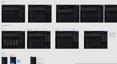
The UX changes we made for Grafana 7.0 -- and what you can learn from them
Behind every part of Grafana, there are the ideas, creativity and commitment of the people who made it. While that includes code, it is not limited to it. Since August 2019, Grafana Labs has had a dedicated UX team, and we have been involved in countless recent features and improvements. We want to show you how we do our work, why you users are at the heart of everything we do – and most importantly, how design changes can make software better.
Azure dashboards: Azure Portal vs. SquaredUp (Part 1 - VMInsights)
Be it be on-premise or in Azure, monitoring your resources is extremely important. While the popular monitoring tool to use on premise remains to be SCOM, many organizations with a presence in the cloud have started to explore Azure Monitor to fulfil their monitoring needs in Azure. Recently, we discussed Azure Monitor and its capabilities extensively in our Azure Monitor Learning Path blog series.


